1. Earth Tones

Earth tones remain a popular choice in 2025, with a focus on deeper and more sophisticated shades. Trending colors in this group include taupe brown for a sense of grounded stability, olive green for a natural connection, and soft beige for warmth and subtlety. These tones not only create a cozy atmosphere but also bring a calming and organic feel to your home.
How to Use:
- Use earth tones as a base for living room or bedroom walls to create a relaxing and inviting ambiance.
- Highlight the space with vibrant décor items like terracotta cushions or nature-inspired rugs.
- Pair them with natural materials such as wood, stone, or linen to add depth and authenticity.
Earth tones promote a serene, warm, and grounded environment, ideal for creating a retreat from the outside world.

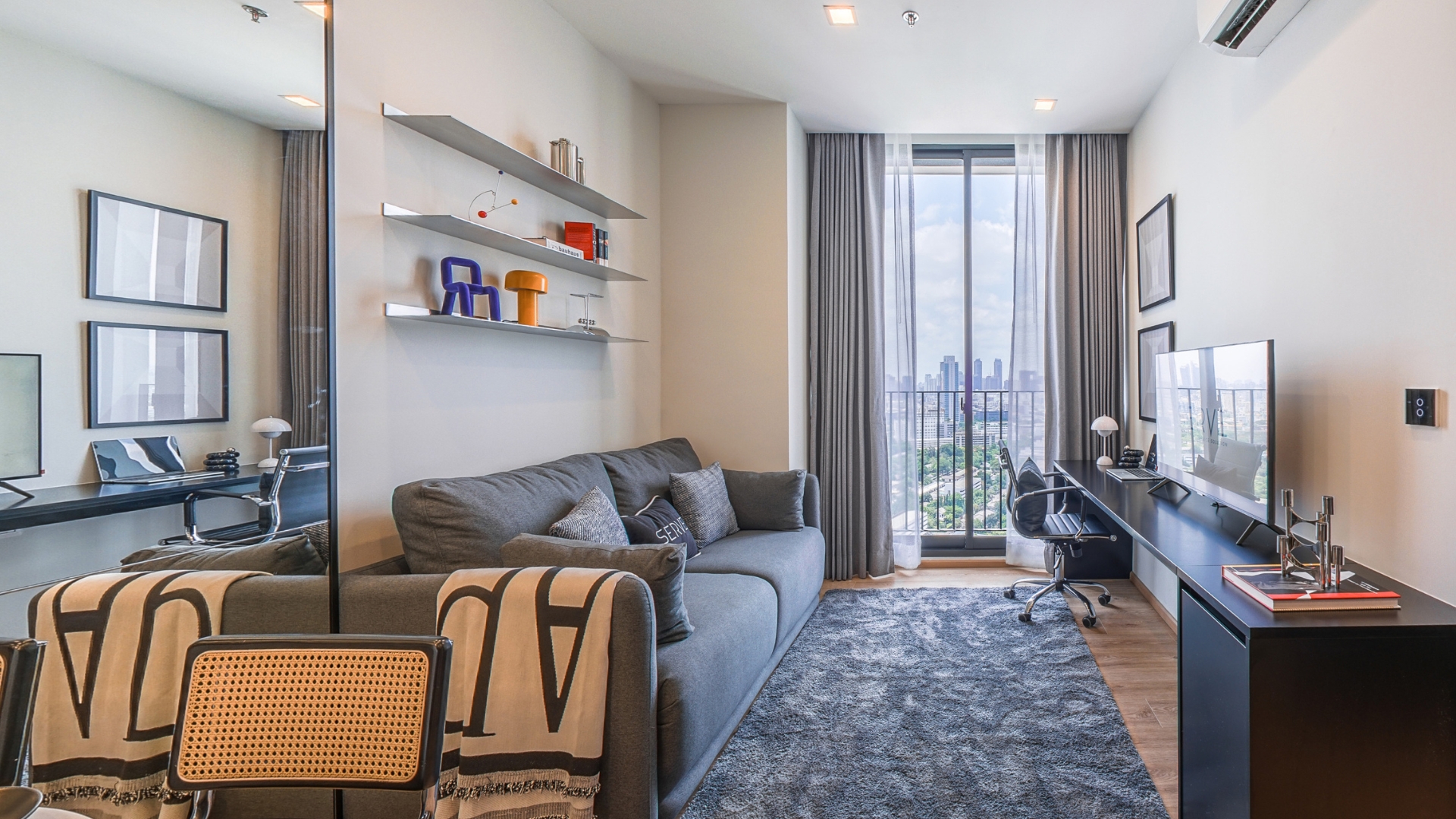
2. Serene Blue-Grey
Blue-grey tones symbolize calmness and balance, reminiscent of overcast skies and tranquil seas. This color is perfect for fostering relaxation and adding a touch of understated luxury. It’s a great choice for those who want to bring simplicity and tranquility into their spaces.
How to Use:
- Apply blue-grey as the primary color in workspaces or study rooms to boost focus and reduce stress.
- Add warmth with natural wooden accents like a wooden desk or golden-brown lighting fixtures.
- Complement with silver or white décor for a luxurious and stylish finish.
Blue-grey creates a calm, sophisticated, and timeless atmosphere, making it ideal for minimalistic yet elegant interiors.

3. Pistachio Green
Pistachio green exudes a fresh and energetic vibe, often used in interior spaces to evoke tranquility and a connection to nature. This color reflects simplicity with a touch of sophistication, ideal for those who love nature and want to create an airy atmosphere at home. Pistachio green works wonderfully on walls in kitchens or dining areas, bringing brightness and vitality. Pair it with beige or white tones for a balanced and soothing effect that enhances the overall ambiance.
How to Use:
- Incorporate pistachio green in kitchen or dining room walls to create a lively and refreshing ambiance.
- Enhance warmth with light wooden furniture or natural décor, like indoor plants.
- Pair with white or beige tones to create balance and softness in the space.
Pistachio green creates a relaxing, invigorating, and nature-inspired environment, making it a perfect choice for infusing positive energy into your home.

4. Lavender Mist
Lavender mist is a shade of elegance and mystery, offering a soft and inspiring feel. It’s perfect for decorating bedrooms or relaxation areas where a romantic and serene atmosphere is desired. Lavender mist adds a luxurious touch when paired with accents in white, silver, or rose gold. This color can serve as a primary shade or an accent through furniture pieces like sofas, throw pillows, or curtains, creating depth and uniqueness in the space.
How to Use:
- Use lavender mist for feature walls or key furniture pieces, like sofas or headboards, to create focal points.
- Complement with white or metallic décor to elevate the overall look.
- Combine with warm, soft lighting to enhance the romantic and soothing ambiance.
Lavender mist evokes elegance and charm, making it perfect for creating serene and inspiring spaces.

5. Terracotta Red
Terracotta red embodies warmth and vitality, creating a lively and natural ambiance. This shade is ideal for spaces where vibrancy and energy are needed, such as living rooms or dining areas. Use terracotta red on feature walls or through décor items like lamps, rugs, or cushions to make a bold statement. Pairing it with natural materials like wood or exposed brick enhances the depth and aesthetic, blending rustic charm with modern elegance.
How to Use:
- Apply terracotta red on feature walls in dining areas to create a welcoming and lively atmosphere.
- Pair with earth tones or white to balance the intensity and maintain harmony.
- Enhance depth with textured materials like exposed bricks or wooden accents.
Terracotta red brings warmth and energy, perfect for spaces that aim to feel lively and inviting.

6. Creamy Whites
Creamy whites evoke a sense of cleanliness, simplicity, and warmth, making them a versatile choice for any area of the home. This shade enhances the feeling of spaciousness, especially in smaller spaces. It pairs seamlessly with natural wooden elements or metallic gold accents for a touch of luxury and depth. Creamy whites are particularly suitable for creating calm and relaxing atmospheres, perfect for bedrooms or living rooms where serenity is key.
How to Use:
- Use creamy whites as the main color for living rooms or bedrooms to create a calm and airy atmosphere.
- Add warmth with wooden elements or gold metallic accents for a touch of luxury.
- Pair with soft pastel shades like blush pink or light blue to infuse a hint of playfulness.
Creamy whites create clean, serene, and modern spaces, making them a timeless choice for interior design.
The year 2025 focuses on balancing beauty with sustainability. The trending colors of this year reflect a deep connection to nature and mental well-being. Choosing the right colors not only enhances your home’s aesthetics but also creates an atmosphere that aligns with your lifestyle and emotions.
Which color trend resonates with you the most? Start incorporating these shades into your home today!